Texas State University employs a popular website content management system (Magnolia branded locally as Gato CMS) to host and manage over 350 university websites. While the system simplifies the website creation and editing process, it has limited page layout options. The template used by the system has not been updated in 5 years and users are unhappy with the look and feel of their website. Annual user surveys consistently identify the look and feel as a limitation for users. Users who understand HTML, CSS and scripting can override the existing template and highly customize their sites. However, this is not the majority of users
In 2013, web support services received an increasing number of inquiries from users on how to update and modify the look and feel of their web pages. In late 2013 I decided to research whether a new paragraph type within the CMS would satisfy the needs of most users.
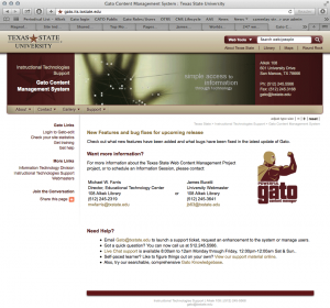
- Ticket Review – Support tickets logged in OTRS were reviewed to identify requests related to design and layout of content, especially in regards to modernizing website look and feel. Sites identified as model sites were also noted.
- Interviews – A number of one-to-one or one-to-many interviews were conducted with CMS users to identify what type of content they wanted to place on their website, and what they felt the current limitations were. Users were also asked to identify Gato sites they considered model sites.
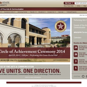
- Model Gato site, College of Fine Arts.
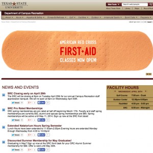
- Model Gato site, Campus Recreation.
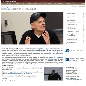
- Model Gato site, MFA Creative Writing.
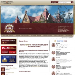
- Model Gato site, Associated Student Government.
- Expert Review – Analyzing the ticket review and interviews I determined a featured content layout was a common component desired by many users. A “magazine” style layout was often described in user interviews. This layout features a central location for a photograph, headline text, brief description and link. Multiple stories rotate through the space and users can click a photo to get more information.
The advantage of creating a new CMS paragraph type were:
- The component could be built within the existing CMS.
- It could be created within a relatively short amount of time.
- It would not require sign-off or input by University Marketing, who owns the overall template design, decreasing development time.
- It could be made responsive, helping to address the increased access of university websites on mobile devices.
- A number of standard designs are already employed across the web utilizing a magazine “featured” items layout. Users are already familiar with the layout and interaction.
- Design work would be minimal.
- Initial Design and Review – The graphic design team then undertook a review of websites with a magazine “featured” items layout and their responsive layouts in tablet and phone. This was then applied with the Texas State web style guide to create a new responsive paragraph layout. The design team and I then met and reviewed the design comps.
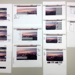
- Round One design review. Overview of all potential designs and layouts.
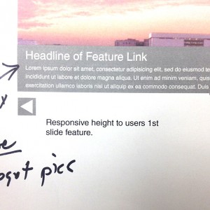
- Round One design review. Detail of my comments on text overlay and size of required image. Don’t judge my handwriting! 🙂
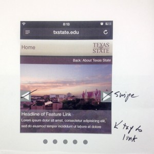
- Round One design review. My comments on phone view.
- Revisions and Round Two Review – Taking the initial comments the design team refined their design and a second round review was conducted a week later.
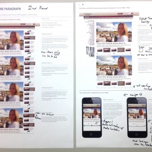
- Round Two design review. My comments overview.
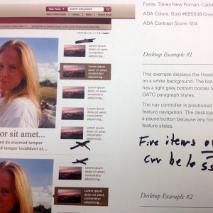
- Round Two design review. My comments on desktop view.
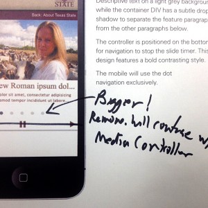
- Round Two design review. My comments on phone view.
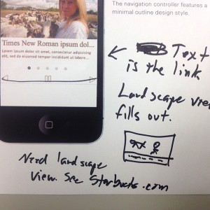
- Round Two design review. My comments on phone view with questions and sketch regarding landscape view.
- Coding Front and Back End – The comps were then provided to the programming team to begin building the paragraph. I created a process detailing how editors would interact with the paragraph when adding new content.
- Internal Testing – Once the paragraph was ready for testing, internal tests were conducted by myself and the design team. Both functional and design changes were made based on system limitations, design preferences and style guidelines.
- User Testing – I arranged hands-on user testing with a variety of Gato CMS users, both power and basic users. Testing was conducted at user’s offices and either audio recorded or screen captured with Camtasia Relay. The recordings were used to check and improve notes made during the testing.
- Final Modifications – Final modifications were made based on user testing.
- Support Documentation – I created new support documentation for users as well as a brief video to introduce the new paragraph.
- Launch – The paragraph was rolled in to our normal launch cycle and an email was sent to all users announcing the new paragraph. It was quickly adopted by a wide number of websites as their homepage featured content.
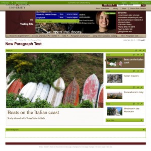
- Content edit mode of new Gato Featured paragraph.
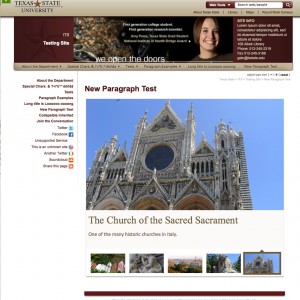
- New Gato Featured Content paragraph with side navigation in production on test site.
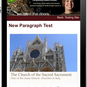
- New Gato Featured Content paragraph in production on iPhone 4.
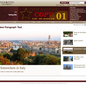
- New Gato Featured Content paragraph desktop view with no side navigation (full screen) in production on test site.
- Post-Launch Lesson – It’s still not enough. The paragraph has improved a number of websites, far too many are employing poorly written code to attempt to modify their layout and navigation. These sites often break on mobile and almost always fail ADA compliance. We need a full template redesign and that process is now getting started with the cooperation of University Marketing.

