In late 2015 I was hired to manage the complete rebuild of the City of Pflugerville, TX website. While the city had already contracted with a CMS vendor and they had created a design I put the brake on the process. After a lot of back and forth with the vendor, I discovered they had skipped the information architecture review and went straight to design. No UX work had been done, no analytics, no testing, nothing. No one could tell me how they had gotten to this point but it was inferred the city was being wishy-washy so they forged ahead. Nope. Stop. Reset.
So I started from the beginning with the following steps, some of which were concurrent:
- Gather Analytics.
- Content Audit of the current site.
- Reviewing current best in class (city) websites.
- Citizen Survey.
- Website user testing with citizens (you are not your user).
- Interviews with current CMS users (gap analysis).
- Proposed navigation testing (card sorting).
- Wireframing new site.
- Let’s be Bold! New designs.
- Navigation Tree Testing.
- Future-proofing the design (responsive, accessible, SEO).
- Add content.
- Launch.
- Fix everything else you missed.
Analytics
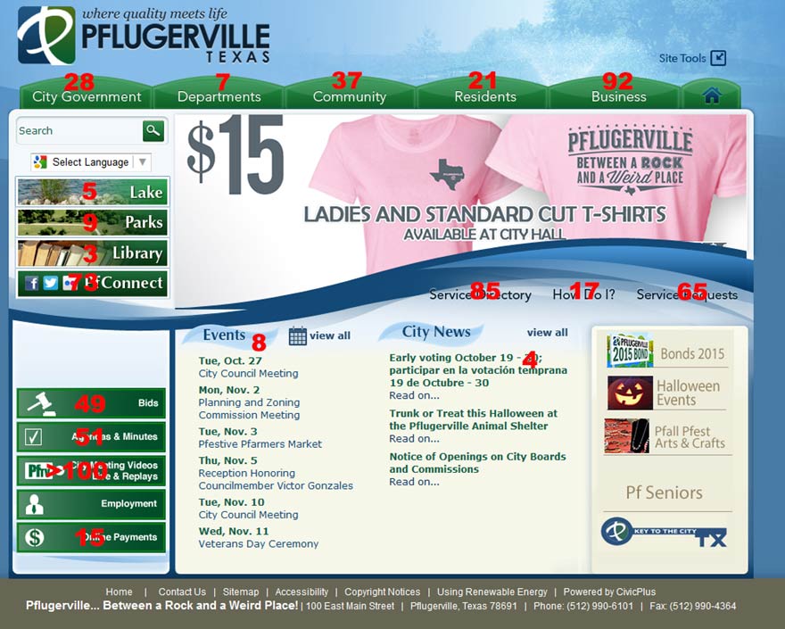
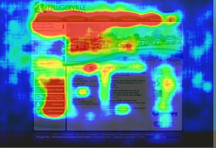
The website data available was okay. The city was not using Google Analytics but did have access to an analytics package from their current CMS host. It gave a solid account of what pages were most popular (page views, visitors, entrances, exits). In-depth site data was not available, but I wasn’t worried about that. I had a lot of user testing planned and mostly wanted it to illustrate some points about the existing website to current management. It’s simplistic, but I built a quick overlay of page popularity of the city homepage. It not only showed what was and wasn’t popular, but it also showed there was a lot of data missing: employment, search, and featured items all lacked tracking data.
Some heatmapping hover data provided by the new vendor reinforced some of what the simple data overlay demonstrated (the top menu is popular and the footer gets no love), filled in some of the data gaps (the Employment link is important and the News is not), and it looked a heck of a lot cooler. It also contradicted some of the data, showing cold spots on the top left menu items creating new questions to explore.
Site Content Audit
- 762 Pages Total
- 463 Live Pages
- 299 Unpublished Pages
- 27 User Groups (roles)
- 57 Authors
The audit had several goals.
1. Remove old, expired content. Any content we can delete, we don’t have to move.
2. Train editors on Writing for the Web. This workshop teaches web writing best practices.
3. Edit all content that editors plan to move to the new website.
4. Identify all 3rd party web apps to see if the new CMS vendor has an equivalent or better service.
Best in Class City Sites
Having never worked in municipal government I was not familiar with its websites. However, there were a number of organizations that offered annual Best of Government Website awards, including the Texas Association of Municipal Information Officers, of which my supervisor was a board member. I used this list as a starting point, along with a number of national competition winners to create a shortlist of three top sites.
Citizen Survey
Prior to testing, a brief six question survey was emailed out to citizens who had self-identified as being interested in city web updates. It asked about devices used, devices owned, locations of web access, use of the city website, residency length, and age.
Peer Website Testing
Once I had identified city websites that had features, navigation, and information architecture that I was considering emulating I created a series of tasks that were crucial and common to the City of Pflugerville website. Via the city’s Facebook page, I recruited citizens to join me at our Library computer lab to participate in a series of user testing sessions.
Participants were asked to complete 13 tasks, either on a desktop computer or a mobile device. Tasks were divided among the three websites. Some sample tasks were:
You are driving home and you see a huge pothole in the road causing drivers to slow and swerve to avoid it. How would you report that to the city?
You’ve decided you really are a cat person. How would find what pets are available for adoption?
You want to have a birthday party in the park and need to reserve a place. How do you do that?
I used screen recording software that also highlighted the location of the pointer in addition to sound. Users were asked to narrate their actions and thoughts aloud as they navigated the websites and attempted the tasks. I have a couple of clips of the tasks below:
Gap Analysis
I conducted a series of interviews with City of Pflugerville staff to find out what they liked about the current site (not much) and what they expected from the new site (lots). Mostly, they wanted the site modernized visually and something they could be proud of.
Card Sort Exercises
I’ve been a huge fan of card sorting ever since I discovered SynCaps while working at Texas State. I’ve used it in the past conducting manual sorts to fix the Texas State University mobile app among other projects. I love the data analysis component that it produces. However, Optimal Workshop offers a great online card sort product with its own robust data analysis and data export options. So I use both! I conduct the Pflugerville navigation card sort online and bring the data into SynCaps for analysis!
Comparing City Navigation Schemes
I quickly noticed there is a lot of overlap from one city website to another. They all offer similar services, right? I wanted just how much overlap there was. What are the common components and groupings and what are the one-offs? Can I discover a universal city navigation scheme?
To accomplish this I examines ten peer city websites and recorded the main navigational and homepage links on each site. Each site was treated as an “tester” in a card sort exercise. The resulting card sort data might reveal an “ideal” or common city navigation scheme. You can see that data visualized below. In the end, only a few things jumped out at me and with only ten entries I wasn’t surprised. If I had time to add about another 30 cities I think the output would get pretty sexy.
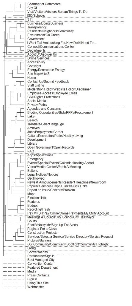
City item dendrograph. Not many revealing groupings yet. You can see some strong subgrouping starting to come together especialy if you look at the image to the right, dendrogram items by group. 
Dendrogram items by group with some solid blues in the subgroups. 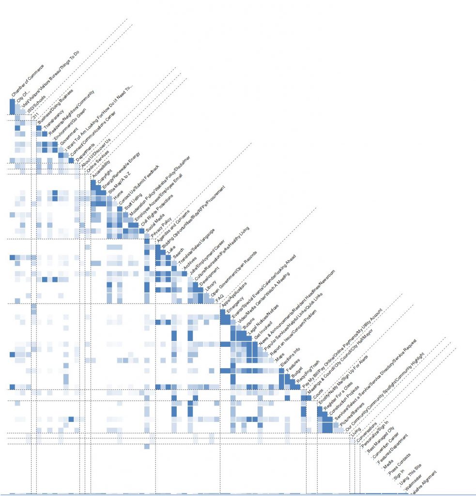
And then the chart bringing it all togther. Again, no great groupings yet, but it has potential.
Card Sort of Pflugerville Navigation
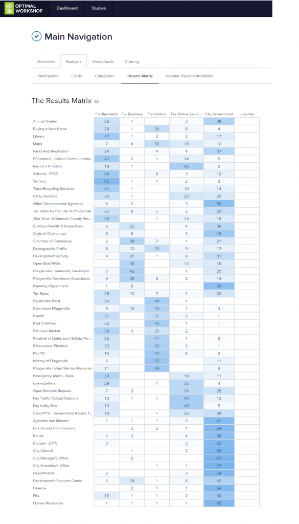
Using existing and potential city navigation gleaned from other city websites items I ran a closed card sort on Optimal Workshop. I had 69 responses and it created very distinct groups.
Importantly, it demonstrated the overlap between the five potential navigational categories. Citizens often had an equal expectation that an item would appear in two different categories. As none of the categories were overly long, I was not concerned about the duplication.
Wireframing
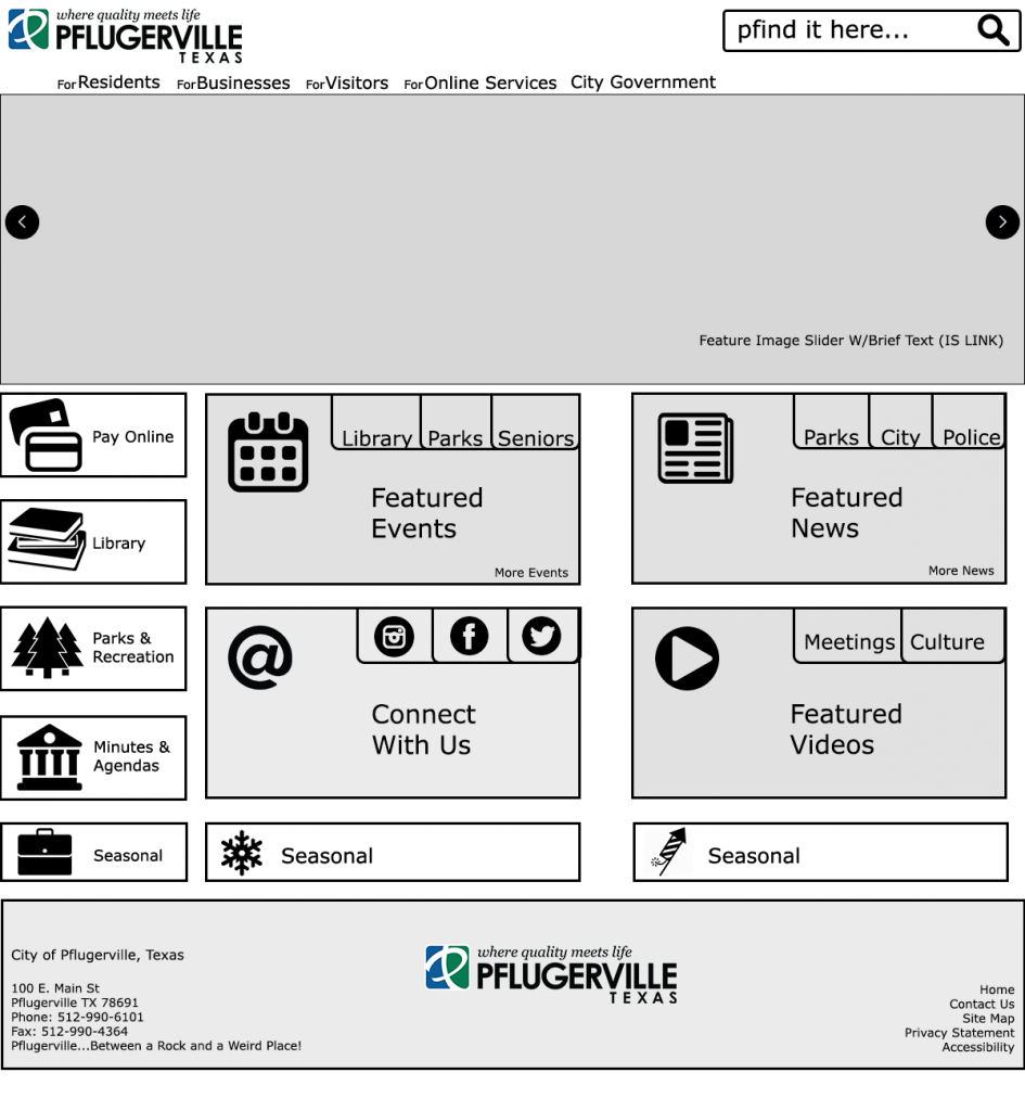
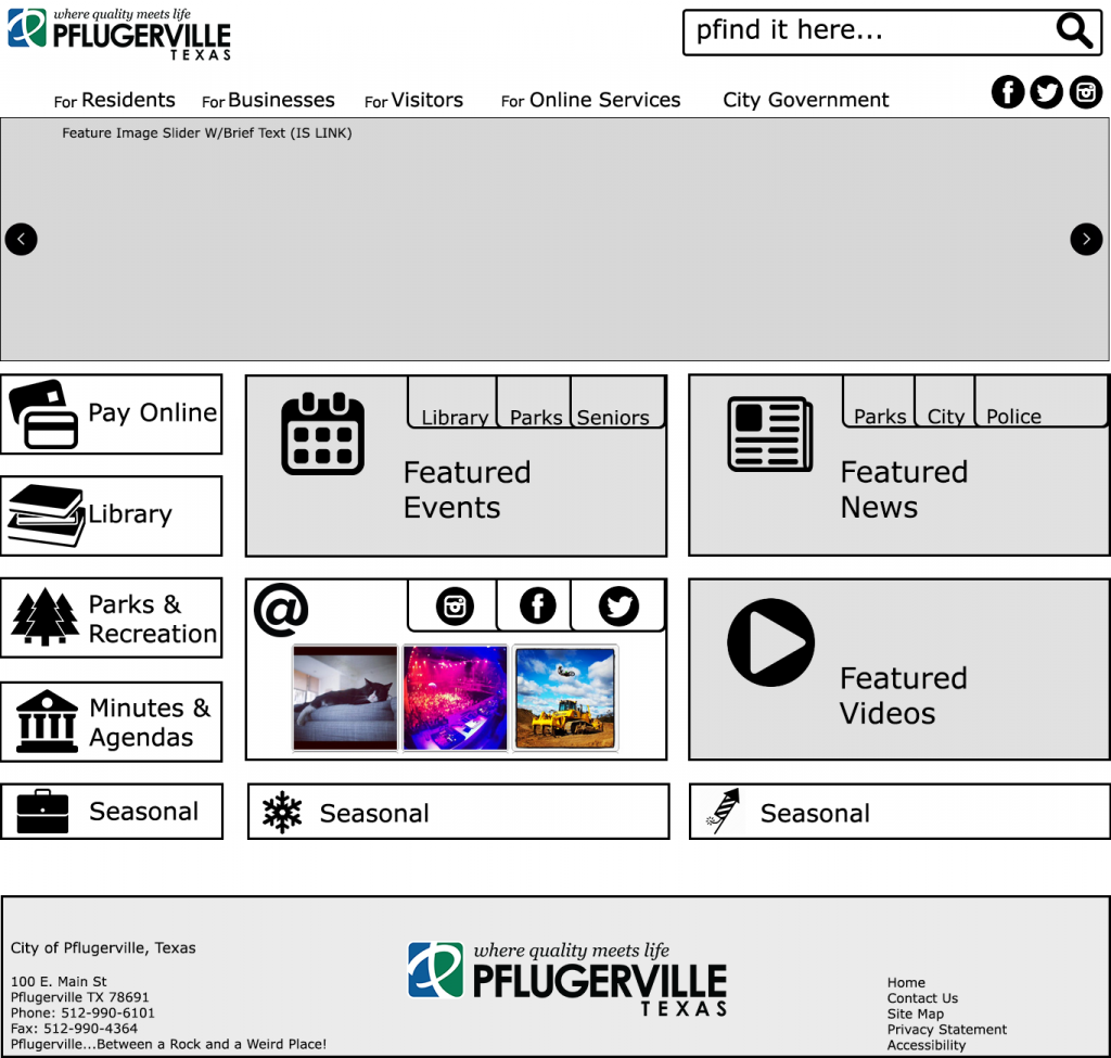
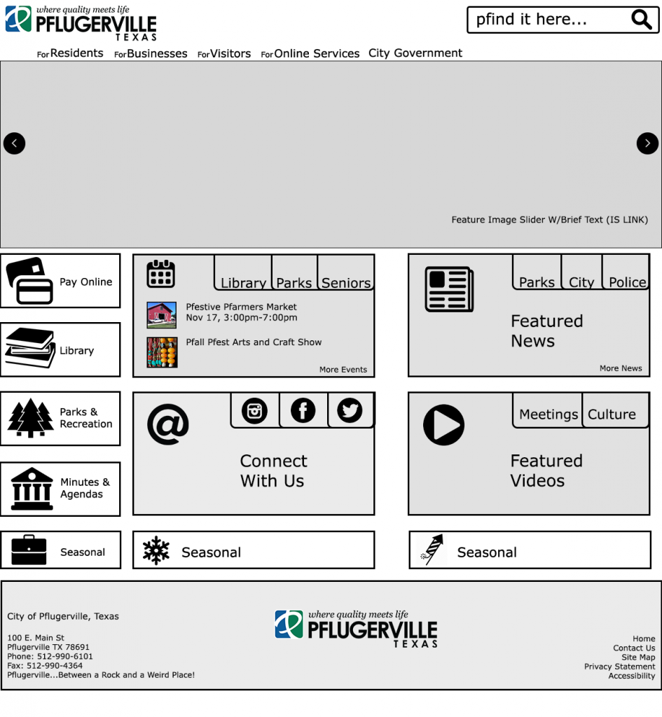
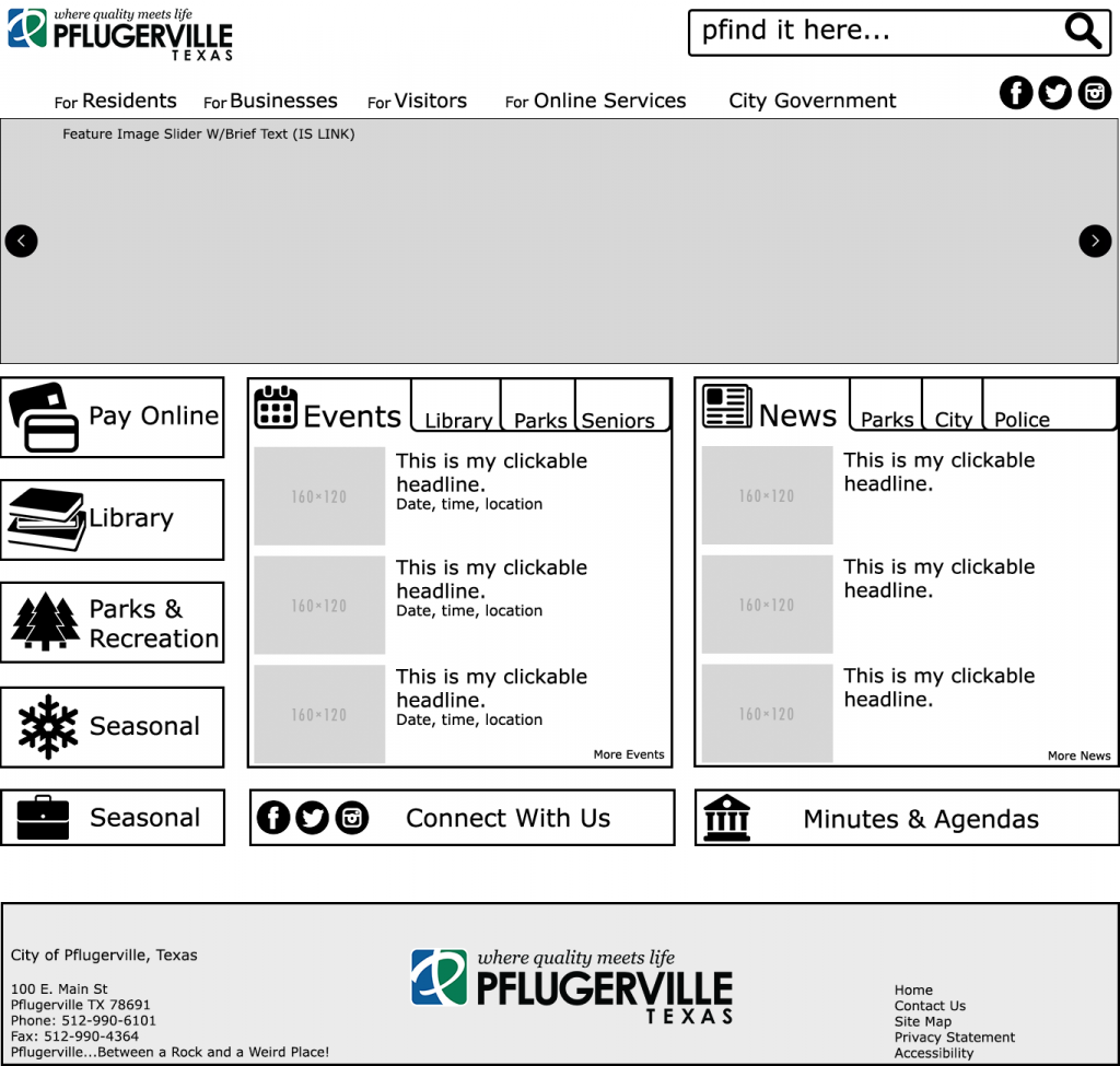
After seeing the design the CMS vendor had provided initially I decided to do the wireframing myself. It wasn’t groundbreaking but it fit within the parameters I had been given and added depth to the homepage. It incorporated more content within a small footprint using multiple content blocks (Events, News, Social Media, Video) and multiple content providers (City, Parks, Library, Police, Seniors, etc.). It used simple icons to highlight top website items. See some mock-up below.
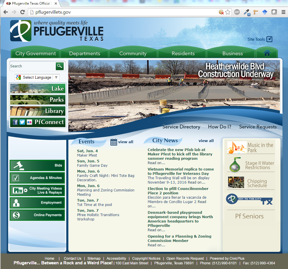
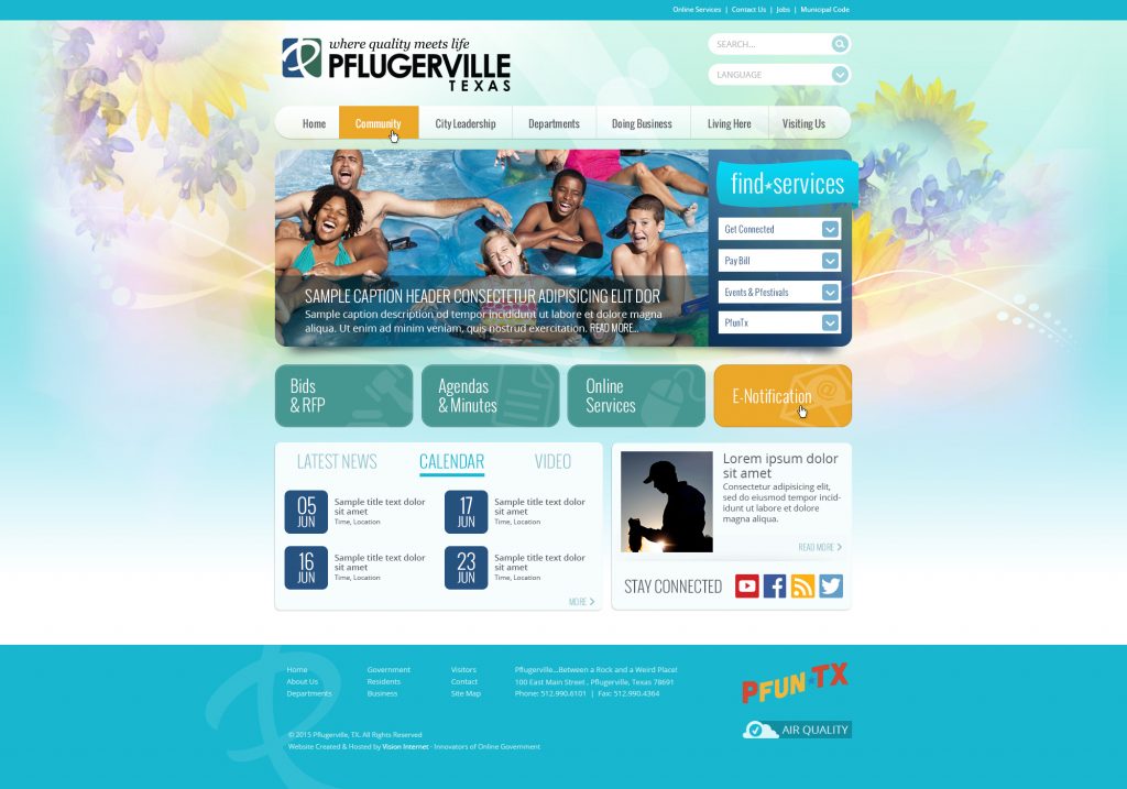
The vendor returns a nice design:

Let’s Be Bold
During the wireframe and design process, I had also been looking at non-traditional website designs that I thought were bold and took advantage of newer technologies and mimicked the phone long scroll. I showed a few to my supervisor, she showed a few to the new mayor, and they liked it. I was given the go-ahead too scrap the traditional design and move forward with something bold.
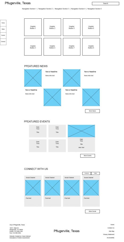
parallax-ish wireframe comp 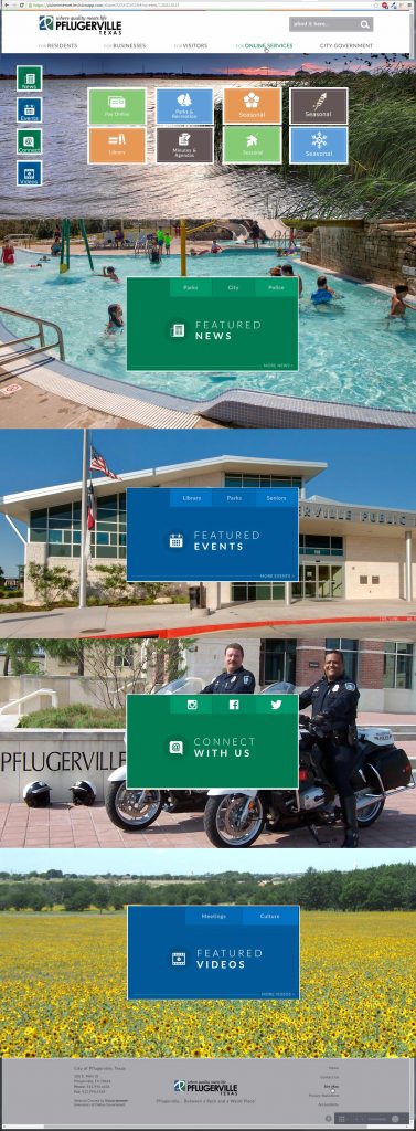
Parallax-ish high def comp i created. Lots of wasted space though. 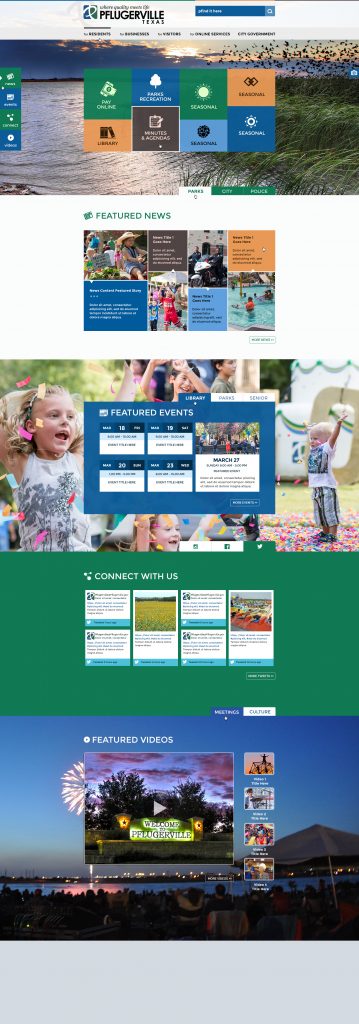
Revised parallax-ish high def comp from the vendor. Better use of space incorporating my previous idea of tabbed content areas.
Subsites for Everyone!
It was also decided we would take the one city website and break it up to highlight the best the city had to offer in learning, recreation, and customer support. I was to create websites for the Library, Parks and Recreation, and Utility Billing.
Tree Testing
I ran these new sites through the same card sorting testing and also incorporated navigation tree testing. Tree testing does a great job of identifying when a navigation term can mean different things to different people or you don’t have a clear path to your content. It also allows for multiple correct paths, which is the reality of most websites. The two results below show a successful task navigation (top) and a very unsuccessful task navigation.
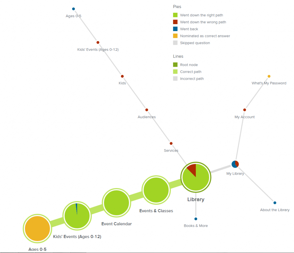
Tree testing results for the task “Find an event for a 3 year old.” This is a successful result! 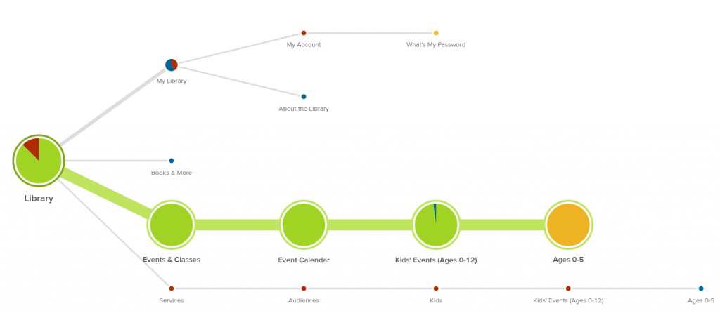
Tree testing results for the task “Find an event for a 3 year old,” – horizontal view. This is a successful result. 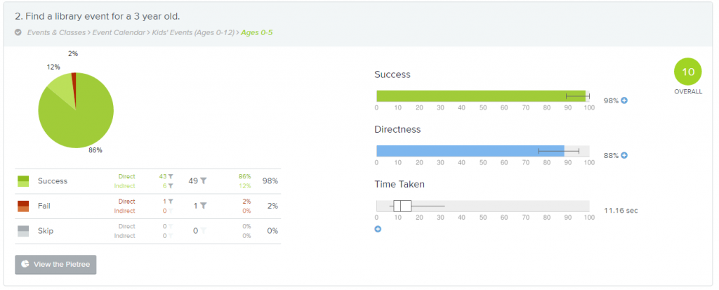
Analytics results for the tree testing 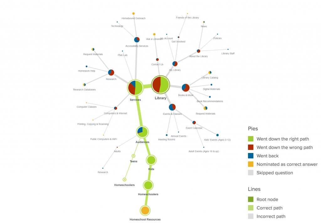
Tree testing results for the task – Does the Library have any resources for home schoolers? This is what failure looks like! 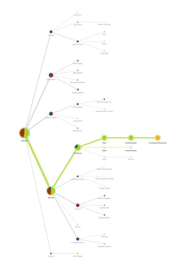
Tree testing results for the task – Does the Library have any resources for home schoolers? – horizonal view. This is what failure looks like! 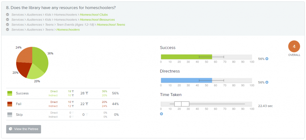
Analytics Results for the Tree testing task – Does the Library have any resources for home schoolers?
Site Builds
Once the sites were created I trained the new content admins and they were set to work on their new sites, which had had their content ported over from the old CMS. Since we had already done a content audit, this was mostly just cleaning up for formatting. But we also took the opportunity to take advantage of new applications available in the CMS. On the list was to convert pdf forms to online fillable forms and build a robust Report a Problem system to replace and expensive and underused phone app.
You can see the final products here:
https://pflugervilletx.gov
https://parks.pflugervilletx.gov
https://library.pflugervilletx.gov
https://utilitybilling.pflugervilletx.gov
https://police.pflugervilletx.gov < added in 2019
Need help with a project? Feel free to email me at mbo@single-track.com


